Love in every detail.

  • Philosophy

With strategy at the heart of everything we do, we pour creativity and passion into every design. From crafting bold brands to building captivating digital experiences, our work is driven by the belief that every project is an opportunity to tell a better story.

  • Our Work

A collection of our crafted solutions.

Filter - Radio
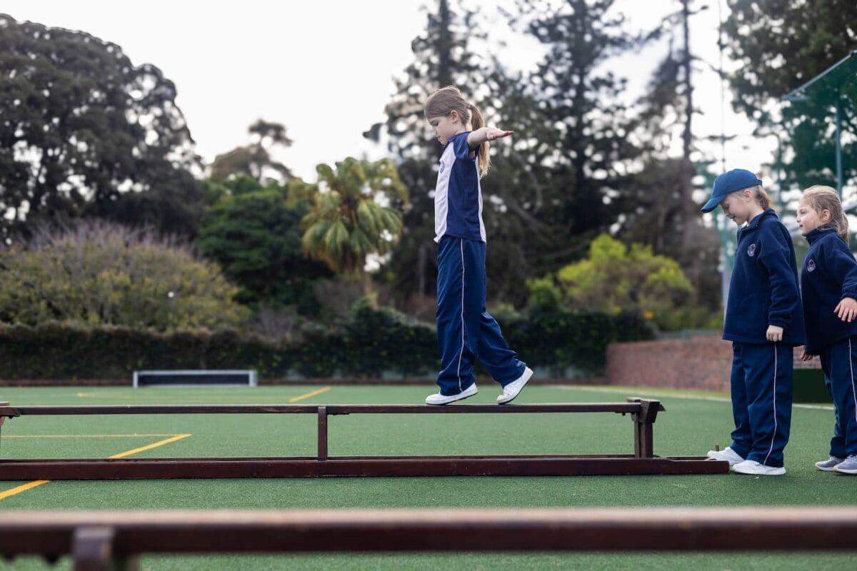
A young Herschel pupil in a navy tracksuit balancing on a beam on the school sports field, arms outstretched, as two classmates wait their turn

Herschel Girls School Website Update 2026

Herschel Girls School is an independent Anglican school for girls in Claremont, Cape Town, founded in 1922 and teaching Grade 000 to Grade 12. one2love built the school’s previous website, and we rebuilt it as part of our web design work in Cape Town. The new site went live on 9 November 2026.

We converted it from Elementor to Bricks Builder in the school’s current brand, carried over all 69 pages and 244 news posts, and redirected every old address. The school’s team now edits vacancies, publications and Council members through simple structured fields. At launch we ran an SEO and AI visibility pass, from search titles to structured data.

In a PageSpeed Insights lab test of the homepage (old site 6 November, new site 9 November 2026), the mobile score went from 52 to 81 and the main content appeared in 4.245 seconds instead of 9.538. The sites ran on different servers, and the new test used an empty cache. The full story, including what the launch checks found, is in our Herschel Girls School case study.

If you are planning a new school website design, tell us about your school.
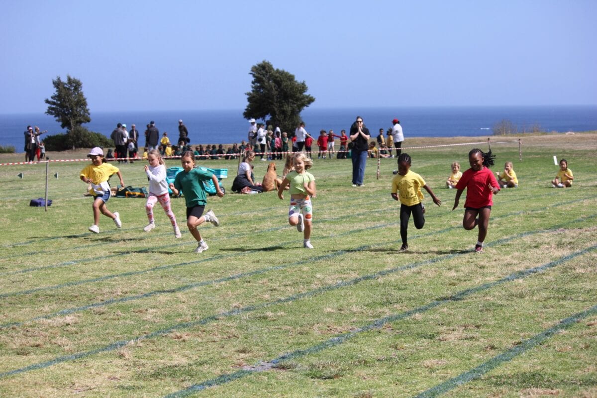
Young Camps Bay Primary pupils racing across the school field on sports day, with parents watching and the Atlantic Ocean behind

Camps Bay Primary School Website

Camps Bay Primary School is a public primary school in Camps Bay, Cape Town, founded in 1906 and teaching Grade R to Grade 7 across three campuses between Table Mountain and the Atlantic. We designed and built its new website as part of our web design work in Cape Town, and it went live on 23 September 2026.

The brief was to replace a dated site and make what parents need easy to find. The new site is built around the two groups who use it most: current parents checking term dates, policies and staff contacts on a phone, and families deciding whether to apply. The home page explains how three campuses work as one school, every page sits in the main menu, and the design follows the school’s own green and gold.

The school runs the site itself. Staff profiles, policies and documents, term dates and page images are simple fields the school office edits without touching the design, and we trained the school’s team before launch. When the termly magazine, The Report, was ready in October, we added a School Magazine page in the same pattern. At launch we ran an SEO and AI visibility pass: search titles and descriptions, sharing previews, a sitemap, structured data for the school’s campuses and descriptive alt text for every image on the site.

If your school’s website is due for a rebuild, see how we approach school website design, or tell us about your school.

Aduna Black Maca superfood powder pouch beside a smoothie and sliced banana, purple wax-print pattern above an orange panel

Aduna Black Maca Packaging

We continued our long-standing collaboration with Aduna to design the packaging for another exciting addition to their premium wellness range: Organic Peruvian Black Maca. Sourced directly from high-altitude regions in the Andes, this rare and highly prized adaptogen required a visual identity that celebrates its authentic heritage while emphasizing its superior quality and natural potency.

The packaging design features intricate, culturally inspired geometry paired with a rich, grounded color palette that pays homage to its traditional Peruvian origins. By aligning this launch with Aduna’s established design language, we ensured the final product feels right at home within their premium superfood portfolio while standing out as a bold, sophisticated choice for health-conscious consumers.

Open-plan living room with an ochre modular sofa, oval coffee table and timber panelling, opening onto a dining area and garden

Facelift Property Website

We partnered with the team at Facelift Property to design and develop a clean, professional WordPress website that effectively showcases their high-end transformations and property services. Initially crafted in Figma and seamlessly built using Bricks, the site’s design focuses on a sleek layout, intuitive navigation, and high-impact visuals that reflect the quality of their craftsmanship.

To truly bring their work to life, the website features an interactive before-and-after slider, allowing prospective clients to see the dramatic evolution of their construction and renovation projects firsthand. The result is a modern, fast, and flexible digital portfolio that not only highlights their diverse services but also serves as a powerful tool for driving new business growth.

Aduna Himalayan Shilajit capsule bottle with a dark patterned label, standing on a pale stone plinth

Aduna Shilajit Packaging

We collaborated closely with the team at Aduna, one of our long-standing clients, to design the packaging for their latest high-potency wellness offering: Himalayan Shilajit Capsules. Building on our extensive history of bringing Aduna’s product ranges to life, the design process focused on balancing the premium, clinical efficacy of 80% fulvic acid with the brand’s signature vibrant aesthetic.

The resulting bottle label pairs intricate, culturally inspired patterns with clean typography. This latest addition seamlessly integrates into Aduna’s existing wellness portfolio while establishing a bold, sophisticated presence on-shelf and online that immediately communicates its premium, source-focused quality.

Turquoise water along a rocky limestone coastline, with villas set among trees on the cliff above

Island Boat Days Branding & Ad Banners

We partnered with David Correia and worked closely with Island Boat Days to create a vibrant and cohesive brand identity that captures the essence of a private escape in Montego Bay. Starting from scratch, we designed the logo and custom emblems, selecting a color palette that reflects both the energy of the sun and the serenity of the ocean.

To drive growth and visibility, we developed a comprehensive set of Ad banners in various sizes. These assets range from high-impact still imagery to simple animated ads, all crafted to highlight the brand’s premium charter services. The result is a bold, recognisable digital presence that invites travellers to reserve their own piece of paradise.

Two people standing under a baobab tree at night, a torch beam pointing up into a star-filled sky

Planet Africa Safaris Website

Planet Africa Safaris approached us to reimagine their existing website with a focus on elevating its visual impact and user experience. Starting with a comprehensive UI/UX assessment, we identified key opportunities to improve structure, performance, and SEO, ensuring the new site would not only look beautiful but work harder for the business.

Designed in Figma and built in WordPress using Bricks, the result is a clean, modern, and highly visual platform that lets their exceptional imagery take centre stage. The new site offers a more intuitive journey through destinations and experiences, creating an inspiring and seamless experience for travellers exploring Africa.

Terraced benches of a large open-pit mine cut into pale rock under a clear blue sky

The Intelligent Miner Website

The Intelligent Miner approached us to redesign and modernise their WordPress website, creating a robust platform to support their growing content and subscription offerings. We led the end-to-end design process in Figma, reimagining the site’s structure and user experience before partnering with iSimon for front-end development using WordPress and Bricks.

Beyond a complex legacy data migration, we moved their podcasts and newsletters from Substack into a unified WordPress ecosystem. By implementing WooCommerce memberships, we enabled secure gating for tiered content. The new site consolidates articles, media, and a shop into a scalable, content-rich platform built for long-term growth.

Emperor Gin Gold Edition bottle beside a mixed cocktail and a bar glass on slate, lit against a dark backdrop

Emperor Gin Website


Emperor Gin needed a simple yet sophisticated online store to showcase and sell their small-batch South African gins. We built a streamlined Shopify website that brings the brand to life; clean, intuitive, and mobile-first. The result is an elegant e-commerce experience that lets the product take centre stage, while keeping the path to purchase refreshingly smooth.

Let's craft your
brand's next chapter.

Get in touch