

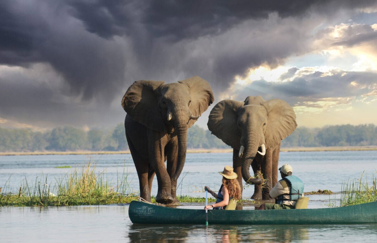
Since 2002, True Africa has been crafting authentic safari experiences that unveil the heart and soul of Africa. As their social media partners, we bring their remarkable journeys to life, sharing intimate wildlife encounters, breathtaking landscapes, and meaningful cultural connections that make their safaris truly unforgettable. Through strategic storytelling and captivating content, we help adventure seekers discover the magic of True Africa’s bespoke experiences.
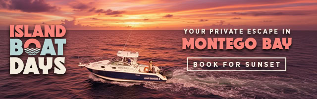
Island Boat Days Branding & Ad Banners
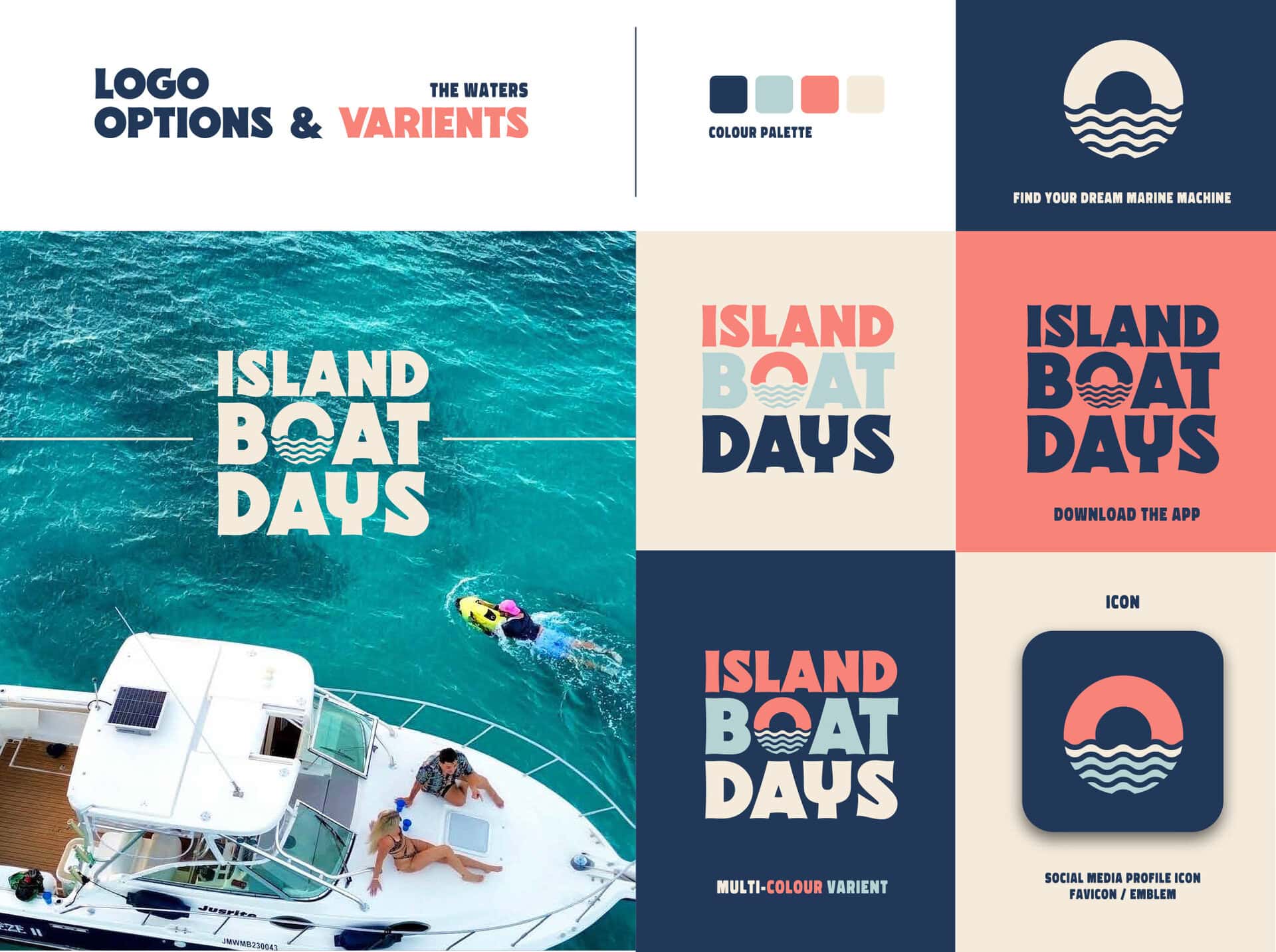
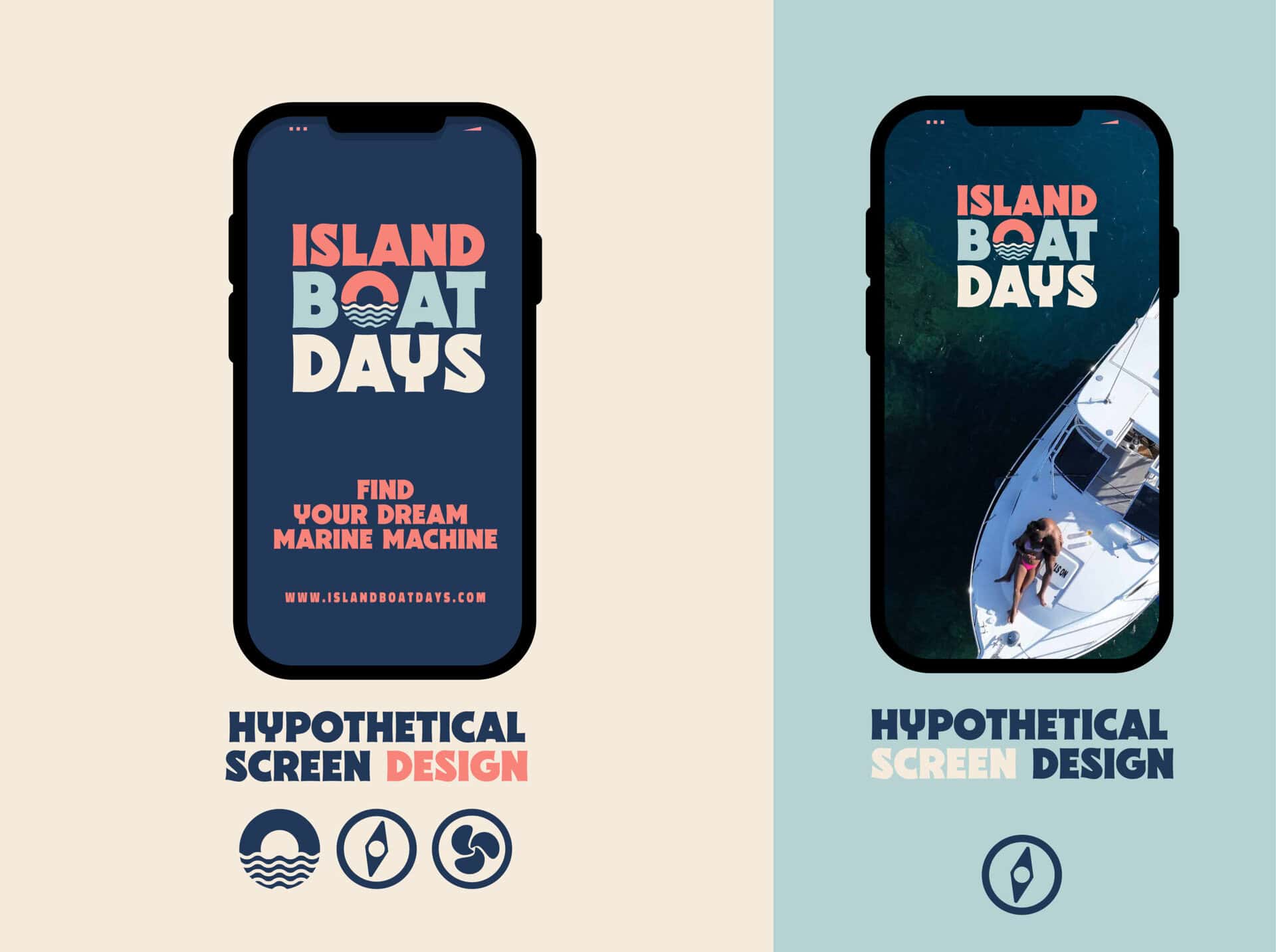
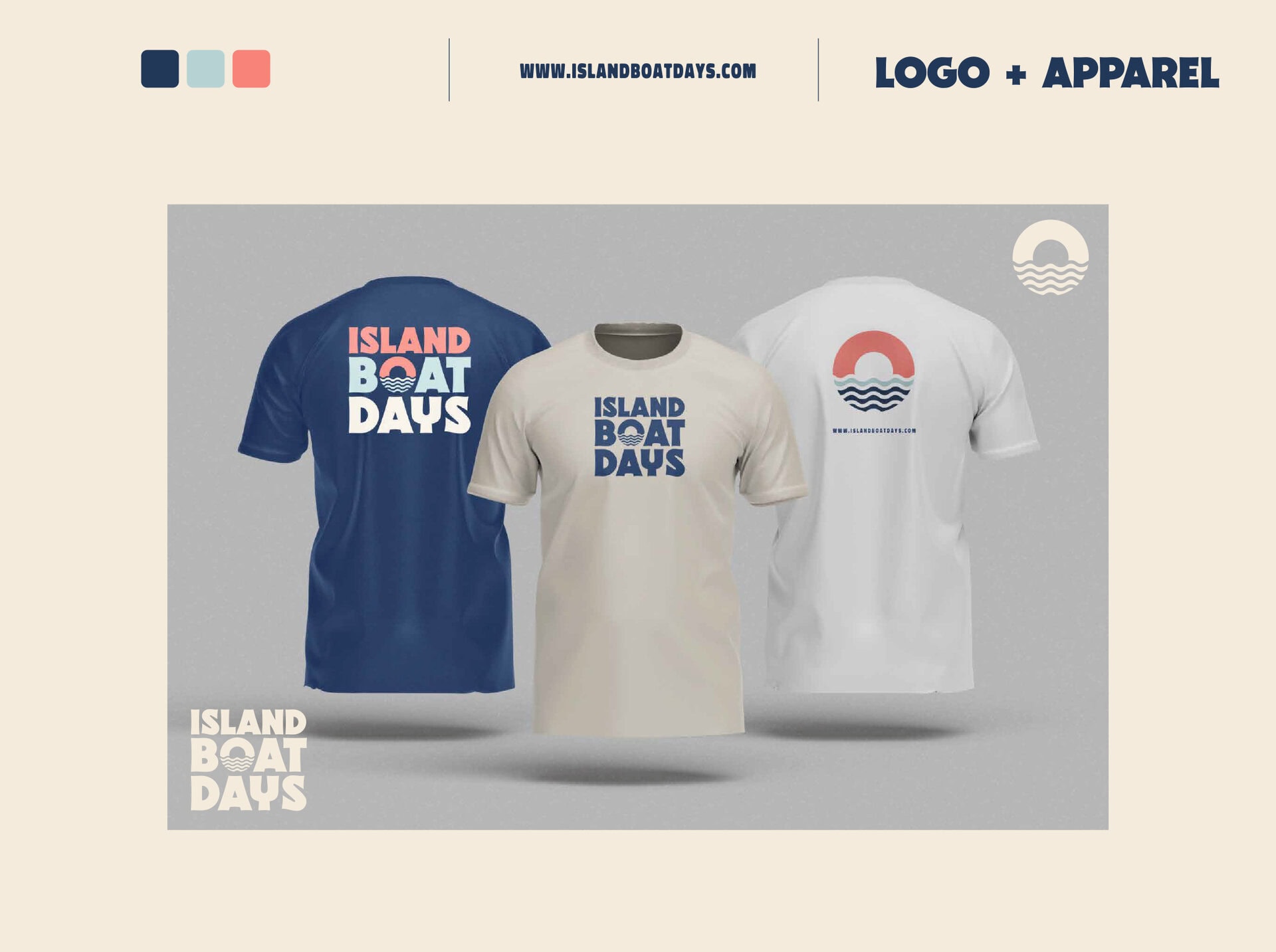
We partnered with David Correia and worked closely with Island Boat Days to create a vibrant and cohesive brand identity that captures the essence of a private escape in Montego Bay. Starting from scratch, we designed the logo and custom emblems, selecting a color palette that reflects both the energy of the sun and the serenity of the ocean.
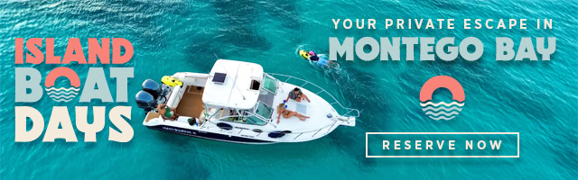
To drive growth and visibility, we developed a comprehensive set of Ad banners in various sizes. These assets range from high-impact still imagery to simple animated ads, all crafted to highlight the brand’s premium charter services. The result is a bold, recognisable digital presence that invites travellers to reserve their own piece of paradise.
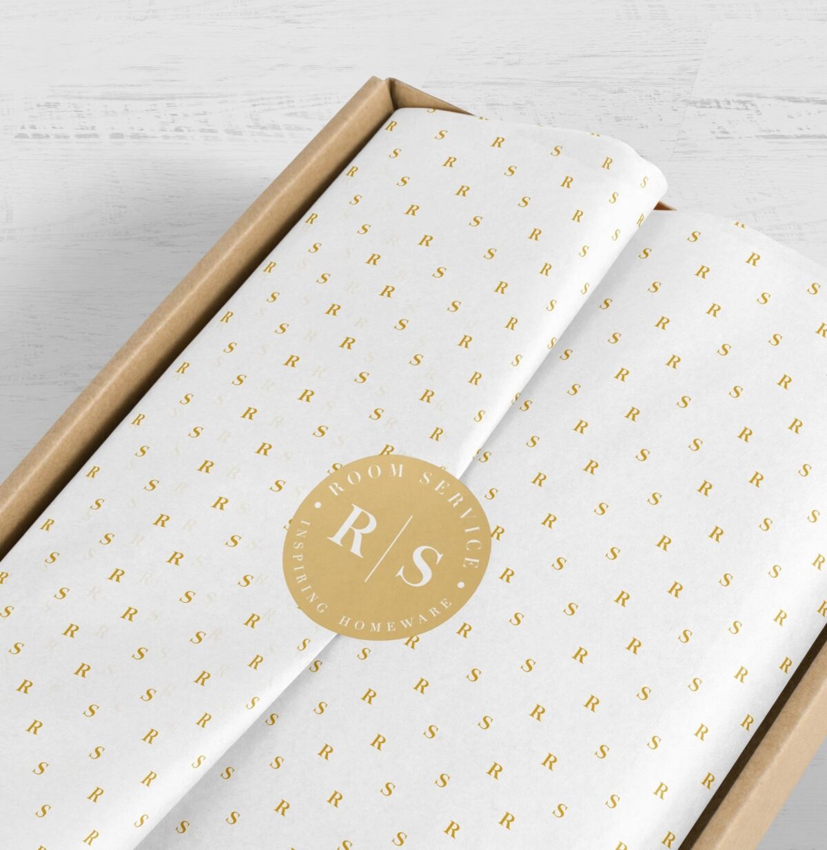
Room Service Homeware Logo and Branding
Room Service, created by a team that has been in the Homeware industry for a cumulative 36 years, is all about inspiring Homeware. We were tasked with creating a new brand logo, packaging and corporate CI for this Cape Town brand. We also designed, developed and maintain their e-commerce website.
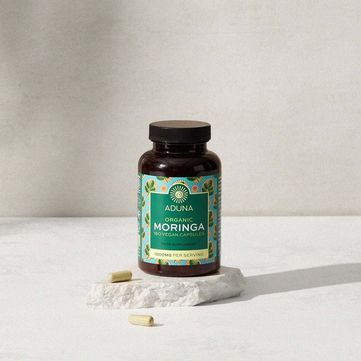
Aduna Moringa Capsule Packaging Design
Aduna Moringa Capsules packaging. They offer a convenient way to incorporate the nutrient-rich Moringa leaf into your daily routine