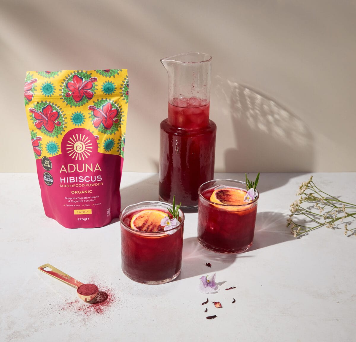
A general brand refresh for the original Aduna product line packaging, Baobab, Hibiscus, Cacao and Moringa superfood powders.
Aduna Black Maca Packaging
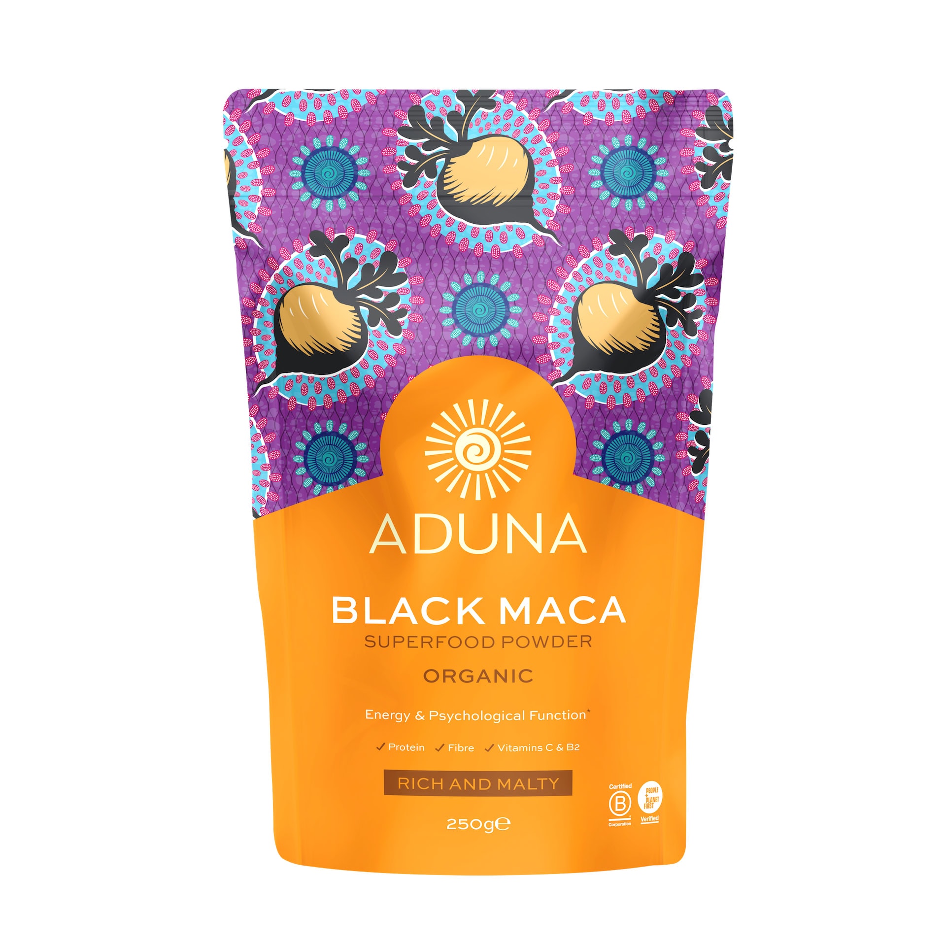
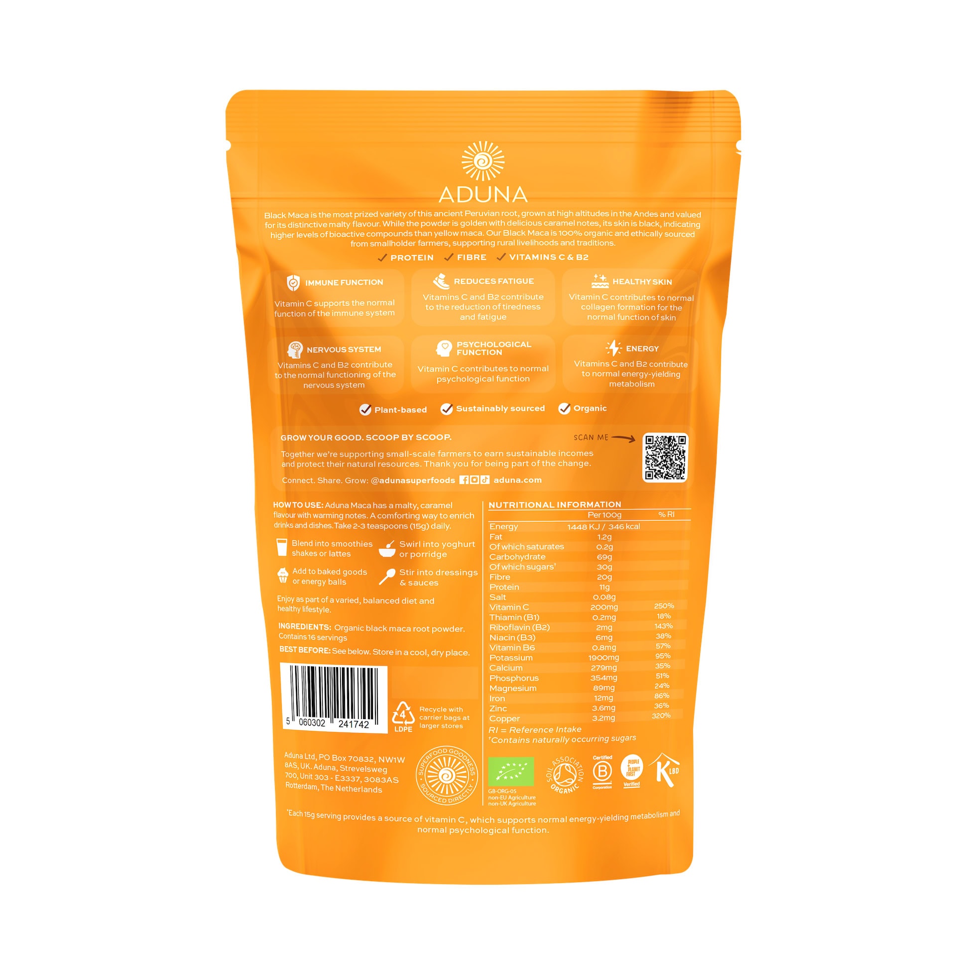
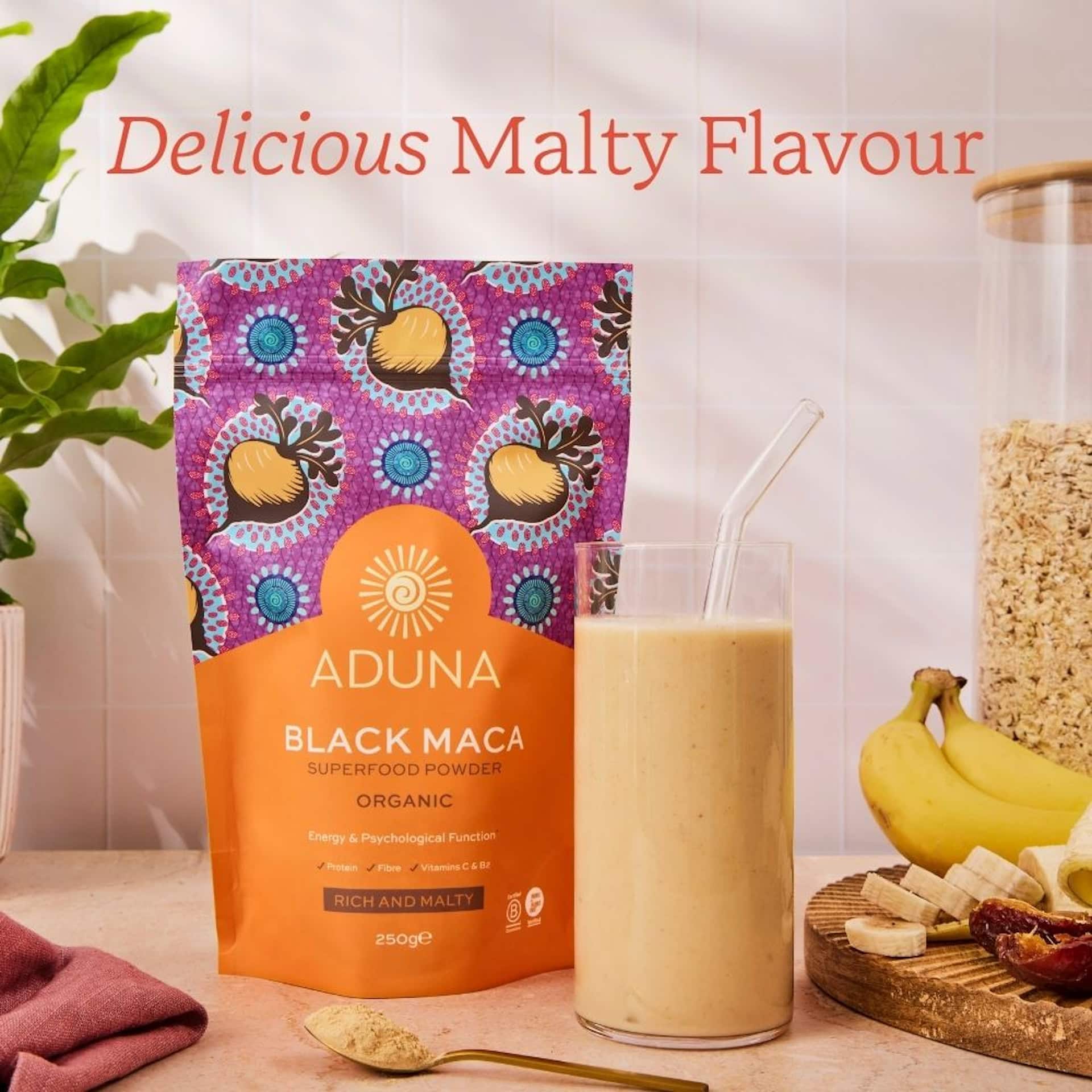
We continued our long-standing collaboration with Aduna to design the packaging for another exciting addition to their premium wellness range: Organic Peruvian Black Maca. Sourced directly from high-altitude regions in the Andes, this rare and highly prized adaptogen required a visual identity that celebrates its authentic heritage while emphasizing its superior quality and natural potency.
The packaging design features intricate, culturally inspired geometry paired with a rich, grounded color palette that pays homage to its traditional Peruvian origins. By aligning this launch with Aduna’s established design language, we ensured the final product feels right at home within their premium superfood portfolio while standing out as a bold, sophisticated choice for health-conscious consumers.
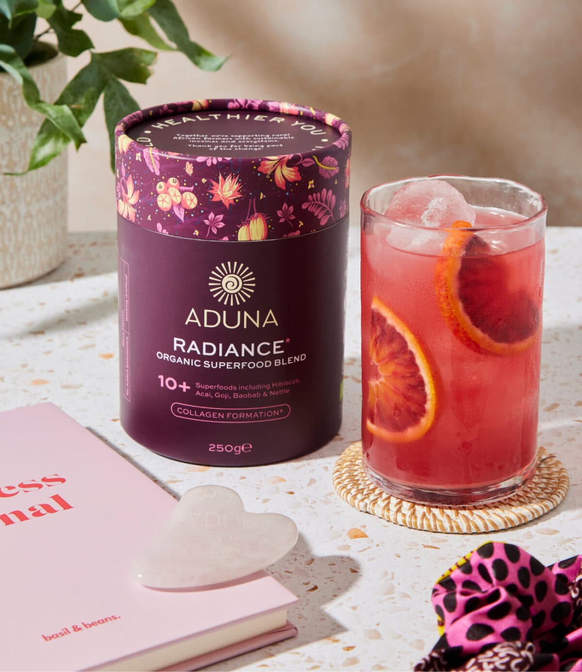
Aduna Superfood Blends Tube Packaging Design
We collaborated closely with the Aduna team to design the vibrant tube packaging for their Superfood Blends range. The final designs celebrate Aduna’s bold, African-inspired brand language while ensuring clear product differentiation and strong shelf presence.

Cape Cobra Website
Cape Cobra Leathercraft has been creating exquisite exotic leather accessories since 1972. Our team crafted an e-commerce platform worthy of their masterful artistry, showcasing their collection of handcrafted bags, wallets, and accessories. The website design reflects the same attention to detail and sophistication found in every Cape Cobra piece, allowing customers worldwide to discover these timeless South African luxury goods with ease.