Somewhere in the middle of a brand guide, a client mentioned that their letterhead used Baskerville.
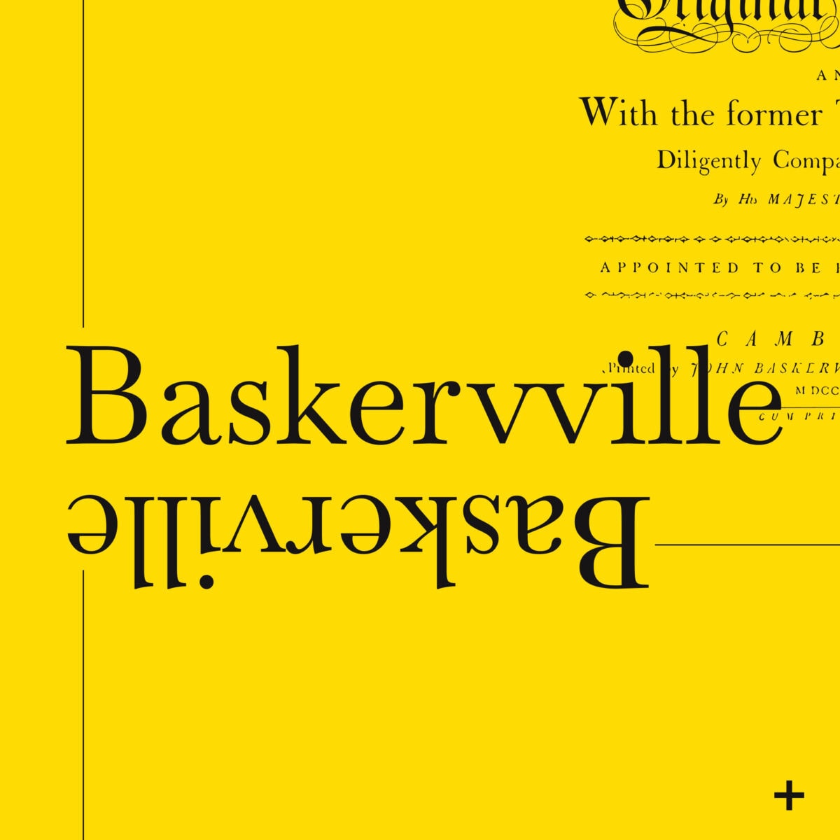
It was a helpful, entirely reasonable thing to say, and it was also wrong in a way that would have been very easy to miss. The typeface we had put in front of them was not Baskerville. It was Baskervville. Two v’s.
One letter, and behind it a different foundry, a different licence, different metrics and a different file. On a printed page the two make almost the same first impression.
The moment
We had proposed Cormorant. Good serif, elegant, the kind of face that behaves well in a headline and stays out of the way in a caption. It was on the table, it was defensible, and we liked it.
Then came the note about the letterhead. Not a complaint, just a fact from someone who knows their own organisation better than we do: this is what we have been using.
There are two ways to handle that moment.
The first is to explain why the proposal is correct. Agencies are good at this. We have all watched a creative director talk a client out of an instinct that turned out to be right.
The second is to go and build the alternative properly, put both options in front of them, and let them look.
We did the second one. Both directions went into Figma, fully applied, not as swatches on a mood board but as the actual type scale, the actual pairings, the actual thing they would live with. The client chose, and the outcome was better than either of us had on the table when the conversation started. That is what the extra day of work buys.
The trap nobody sees coming
The typeface now sitting at the centre of that brand is Baskervville, from Google Fonts, spelled with a double v. It is a revival, it is open source, and it is free to use.
Baskerville is a different thing. Monotype’s Baskerville is a licensed commercial family, and there are other Baskervilles besides. They look like cousins because they are, but they are not interchangeable. Different metrics means different line lengths. Different licences means different rules about what you may embed in a website, a PDF or an app.
Now imagine none of that is written down.
Six months from now somebody is building a page, or a printer is setting an annual report, or a new supplier is asked to “match the brand”. They search for the font. They find Baskerville, because that is the famous one. They install it, they set the page, and it looks almost right.
Almost right is the expensive kind of wrong. It survives every casual review. It gets caught, if it gets caught at all, by someone with good eyes and a bad afternoon, usually after the print run.
So a brand guide has one real job, and it is not to look impressive. It is to be specific enough that the next person cannot get it wrong by accident. Writing down “Baskervville, Google Fonts, double v” costs nothing. Discovering it live costs a day, and sometimes it costs a reprint.
A brand guide is not a document
The old model was a PDF. Forty pages, beautifully typeset, delivered as a milestone, filed in a folder called Brand, opened twice. Within a year it disagreed with reality, and everybody quietly stopped consulting it.
What we handed over instead runs off variables.
The type scale is tokenised. So is the colour palette, the spacing, and the type and colour pairings, which is the layer where most guides go vague and most brands go inconsistent. Every one of those values lives in one place in Figma. Change a value once and it flows through everything downstream. The type scale updates, the pairings update, the examples update, and nothing goes stale because nothing was transcribed by hand.
A brand guide that is a document describes the brand. A brand guide that is a system enforces it.
The difference shows up in the boring moments, which is the only place it ever shows up. Somebody needs a colour at nine at night, the night before a merchandise order or a print deadline. Either there is one authoritative value they can copy, or there is a judgement call, and judgement calls are how brands drift.
Why this matters for the build
There is a practical reason we work this way, beyond tidiness.
The website comes next. When the design system is already tokenised, the build inherits it. Type scale, palette and spacing all move across as structured values rather than as a designer’s screenshot and a developer’s best guess. Nobody eyeballs a hex code off a JPEG or rebuilds a spacing scale from scratch because the handover was a set of flat images.
We talk a lot about being one place for the strategy, the design and the build. In practice that means a shorter route from a decision to a rendered page, with fewer places for the brand to leak out along the way.
What a retained month looks like from the inside
None of the above is a project with a launch party. It is a font question raised in passing, an alternative built properly rather than argued away, and a double v written down where somebody will find it. It is a palette turned into variables so that next year’s designer, who we have not met, cannot get it wrong.
That is the unglamorous shape of retained design work, and it is what decides whether a brand still looks like itself in three years.
Most brands do not fall apart. They drift. One near-enough font here, one slightly different blue there, a supplier who did their best with what they were sent. Nobody makes a bad decision. The brand just quietly stops being one thing.
A guide that lives as a system, maintained by people who know why the second v is there, is how you stop that.
Many years in, we still think the most valuable thing we do for a brand is make it hard to get wrong.
If your brand lives in a PDF that nobody has opened since it was signed off, or in the collective memory of three people who have all left, that is worth a conversation. Have a look at what we do with branding and design, or get in touch and tell us where it hurts.